Changing
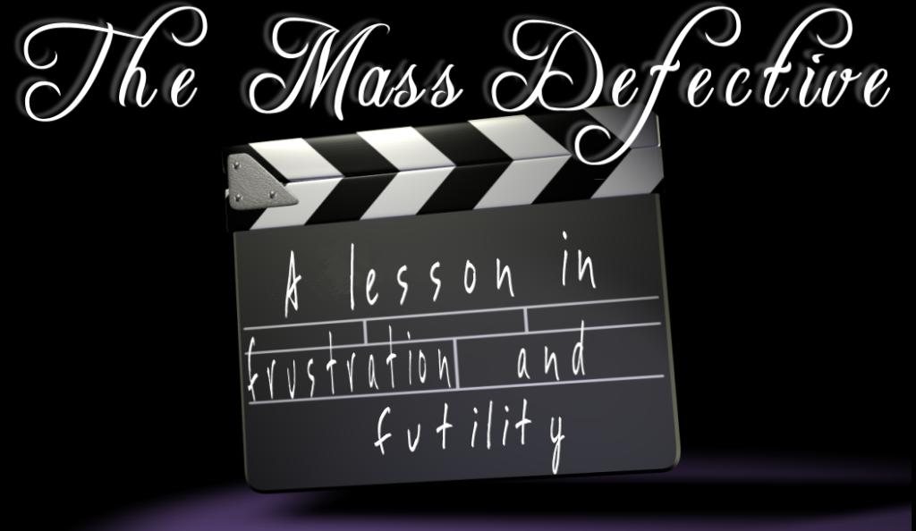
Yes I changed the layout of this blog a bit, and no I'm not liking what I see at all. I started with the line "lost in a swirl of confusion" and things progressed from there. That's typically how the changes come about, with a particular catch phrase coming to mind, then finding a photo that fits with it and so on. Only this time I guess I was artistically challenged by the swirl I'm lost in cuz it honestly looks like shit. Back to the drawing board I guess.


5 Comments:
I quite like this one Sid. It has an Alice-in-Wonderland feel to it!
I like this alot!!!
I also like your new avatar.
Very cool!
Anytime you get an idea that feels right, you should run a million miles with it. This one feels good, and is only contradicted by the occassional blue picture (and one of those pictures shouldn't go away, and it's not Obama's).
...I forgot what I was saying.
I'm sure it was something encouraging and supportive, though.
i like it, i think you should keep it!
angela
I like it, too. It's very you. Maybe all you need to change is the font? It doesn't seem to blend seamlessly with the blackboard. But that's just a thought. Great job otherwise!
Post a Comment
<< Home